
Puma
At first glance, Puma's Mongolian Shoe BBQ is a great concept: a restaurant setting with smiling maitre'd, a menu of (shoe) options, and even a Confucius-sounding voice over reminding customer's that "Patience is a virtue". Despite these pleasantries, however, I found the site much too detailed and very complicated to maneuver. The user is given the option of either starting with no design or with pre-set variations of a design. Puma's attempt to replicate the Mongolian BBQ experience and more importantly, the company's attention to detail in doing so, created some unique challenges. The Dine In and Express Line options were somewhat true reflections of the effort a customer had to exert to create the perfect shoe. The Dine In option required much patience, while the Express Line option was fairly easy to navigate.First, the Dine In option:
- The chopsticks were a bit difficult to navigate the page with, even with the help of a mouse. However, Puma gets points for its attention to detail.
- The bowls were a bit confusing at first. Though labels were provided to aid in the selection process, the default option forced customers to wait until all the components were selected before the finished product could be seen. However, the customer could preview the creation if he or she so desired. While this last aspect was a nice touch, it went against the principles of the voice over ("Patience is a virtue").
- To assemble 18 components of a sneaker was tiresome, but having to wait as each component was loaded onto the preview slide tested patience.
- On a positive note, the Dine In option at Puma seemed to have provided the customer with more options in comparison with the Nike site.
Here's my creation from Puma:


Nike
The Nike site seemed more in tune with its customer base, and demonstrated true international flair with language options at the homepage. I was impressed further with the option to select world regions. Nike offered many more options from the onset, in terms of categories-Running, Basketball, Track and Field, and so on-as well as popular Nike niches like Nike Shox, Nike Pro, and Nike+. Four steps and a blend of creativity plus personal tastes later and the customer's shoes are displayed.One aspect that was particularly appealing at the Nike site was that any changes made to the shoe design were seen immediately, as opposed to the Dine In option at the Puma site, which by default did not allow the user to see changes until the end. Nike also took personalization to the next level with its customizable shoe size for both the right and left shoe (for people with different sized feet); this option demonstrated the effort the company put into making customers boot their computers off with a sense of accomplishment, and value for money. The option to personalize, or tag the design, was also a nice touch. For example, a personalized shoe could include certain user-generated wording through the iD tool that Nike provides. Also, users could save the design as wallpaper (for both Macs and PCs) or display designs in their locker rooms using the myLOCKER option. Despite all these creative concepts, there was one problem with the site:
- On the 'View Options' tab, the design reverts to the original view, making it difficult to see the shoe from certain angles as various components are added.
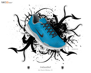
Here's my Nike creation:
Overall, the Nike site was more user-friendly and seemed to provide more options to the user compared to Puma. With this in mind, I think that Nike used technology to create the better customer experience. However, in terms of design quality, Puma won hands down in my opinion simply because Nike seemed to have only the standard colors as opposed to the myriad of textures and great designs (as seen on the collar lining) that Puma offered to users. In other words, from a purely functionality and usability standpoint Nike was clearly the winner, but when it came to design, Puma took the trophy. Nike did a stellar job with its personalization option (especially the iD feature) while Puma didn't perform as well in terms of allowing the user to personalize the product with words. However, the quality of the design from Puma trumps Nike's offerings in my eyes. Based on these observations, Nike wins on the basis of personalization of its products as well as the functionality and usability of its site while Puma wins on the basis of design quality and effective use of themes to create a certain ambiance.