Saturday, March 29, 2008

Kudos to the World!

My daily trek to Google was marked by surprise today, for lo and behold, there was darkness! At first, I thought I had misspelled it, but no, the page had the familiar logo, the empty search bar, and of course, I saw that magical button that answered my queries on the daily.

Turn your lights down low, Google

So, what happened then? Well, for starters, Google just went up a notch in my Corporate Social Responsibility book, but that's not the point. Secondly, for those of you that don't know, March 29, 2008 is truly special because for an hour today, people from all over the world have been encouraged to flip the switch, conserve energy, keep it off...do the right thing if you may. Ah yes, it's Earth Hour!

A little history:
  • The first Earth Hour was held in Sydney, Australia on March 31, 2007 between 7:30 pm and 8:30 pm
  • Estimated to have cut Sydney's electricity consumption by up to 10%
  • As many as 2.2 million people participated
And here's the deal for 2008:
  • Same idea, but with international flair
  • 8pm-9pm in local time zones
  • Some partner cities include New Delhi, Singapore, Christchurch, Trondheim, and Miami
So, to wrap up, the idea here is for everyone--households, businesses, and the like--to turn off non-essential electrical appliances between 8pm and 9pm today to promote electricity conservation and help our planet out by lowering our carbon emissions. In the words of the late, great Reggae icon Bob Marley,"Turn your lights down low!" I think he was on to something....

Thursday, March 20, 2008

Nabisco

Nabisco, formerly called the National Biscuit Company, is a well known brand consisting of a wide range of cookies and snacks such as Oreos, Ritz Crackers, Wheat Thins, Ginger Snaps, and many others. As with any company showcasing their products online, Nabisco employs several strategies to direct traffic to their webisite.

One can see that the site is flash dependent and designed primarily for experiential users, specifically gamers. However, there are some aspects of the site geared toward task oriented users. Users can, for example, get nutrition information on every Nabisco product as well as sensible snacking tips, including great recipes which incorporate many of the company's offerings. The homepage contains links to create a profile for new users as well as one for returners to sign-in; this strategy is very effective at both generating new users for the database and ensuring that users return to the site. Once users register at the site, they can enter promotions, post their high scores, and also receive news and promotions from Nabisco.


There are several types of games to appeal to a wide spectrum of gamers- arcade, puzzle and cards, sports, and multi-player. One interesting finding on the site is that many of Nabisco's products are integrated into the actual games. For instance, users can play Toasted Chips Poker Macthup, or Wheat Thins Sudoku. Not only does this provide entertainment for users but also promotes the company's products during play. Multi-player games are great for driving many people to the site at one time since friends can meet online and participate in a virtual tournament. On a side note, Nabisco must be given kudos for warning gamers, specifically children, of 'ad breaks', which are commercial messages seeking a purchase from the user. The warning reminds underage users to get a parent's permission before submitting personal information.

Nabisco does not sponsor any links at major search engines like Google or Yahoo! A keyword search for Nabisco will reveal in excess of 20 pages for the company and its branding names in other countries. One example of this is the Christie brand in Canada or Kraft foods in other parts of the world. Meta-tags on the homepage attest to the gaming nature of the site and the integration of the brands into these games. One such meta- tag reads: "Free web games and online sweepstakes at NabiscoWorld. Try the many varieties of Nabisco cookies and crackers." Title tags change slightly with navigation to the various pages of the site, but always contain some portion of the brand name.


In conclusion, the company is not conventional in its approach to driving traffic to its site but users return to play games, check out recipes and promotions, and subconsciously view Nabisco's products through their integration in the many games on the site. The company does a great job with customer retention through required log-in to play games but it also simultaneously takes advantage of its database by way of providing information to users on new products, recipes, and tips on Nabisco products via email. As mentioned earlier, some techniques Nabisco uses to drive traffic to its site are:
  • Search engine registration with Google and other major search engines
  • Contests and Giveaways
  • E-mail marketing through promotions and news
  • Loyalty and Continuity programs-with the ability to post high scores.
These are excellent strategies to help Nabisco promote their products and drive and retain traffic to their site.

Monday, February 25, 2008

Rated PG

In recent times, the traditional approaches to product branding have been challenged at even the most established companies. The Internet has changed the styles and techniques used in product branding and with the rapid development of this medium, traditional approaches are all but disappearing because of rising advertising costs and other factors. In essence, advertisers and marketers have felt the push toward online branding as traditional advertising is challenged by competing technologies such as the Internet and other cheaper alternatives. As a result, many companies-large and small- have had tremendous success with this shift in the branding of consumer products from traditional media such as print and television to the Internet.

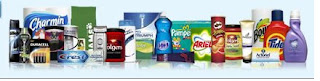
One company that seems to rely heavily on the Internet for the branding of its products is Procter and Gamble (P&G). The company prides itself on being truly global in its offerings and boasts that their products 'touch the lives of people around the world three billion times a day'. As with any successful company, P&G operates with its core principles-personal integrity, respect for the individual, and doing what's right for the individual-rooted in its day-to-day operations.


There are two main models that companies can employ with respect to the organization of their brand portfolios: a house of brands or a branded house. Under a house of brands strategy, the company markets a range of separate brand names, with product-specific marketing. Conversely, a branded house strategy treats all products as an integrated brand, meaning that the company acts as the brand and all its products as subsets of that main brand.

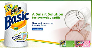
P&G employs a house of brands strategy for the hundreds of products it offers to consumers. This can be observed in the company's product-specific marketing in terms of the taglines, colors, and brand personalities. For instance, Bounty Paper Towels has long been marketed as lasting, and persistent and has come to be known as 'the quilted quicker picker upper' while Puffs Tissues has been marketed as soft, cuddly, and nurturing with its 'A nose in need deserves Puffs indeed' tagline. These two products, despite being in the paper products category, are marketed very differently to consumers.


P&G has several categories under which its various products can be found, ranging from Personal & Beauty to Pet Care & Nutrition. Under each of these categories are sub-categories that are more specific to consumer needs. For instance, under the Personal & Beauty category, Body Wash, Shaving, Colognes, Oral Care, and Hair Care are all sub-categories. With this approach, customers can easily navigate to specific products or brands with the click of a mouse. Most products have a unique domain name (eg, downy.com or braun.com) and a site that reflects its personality through the use of unique colors and taglines. There is usually no mention of the product's link to P&G, making it seem as if there is no affiliation with the parent company.

P&G's house of brands approach is ideal because of its many product offerings. This strategy allows the company to easily segment their target markets, while simultaneously reinforcing the personalities of the various product lines that are available to consumers. In addition, this approach to online branding avoids confusion and establishes dominance in the myriad of product categories that are available to P&G consumers. Such an approach also allows consumers to form brand communities and gives the company considerable leverage in brand-specific promotions.

P&G's house of brands approach may also have some weaknesses in that most products are not explicitly associated with the company, resulting in decreased corporate recognition and image. Also, with such a vast array of products, P&G does not have a consistent brand message and this may be viewed as an opportunity for competitors. There is also potential for brand promotions to be overlooked by consumers of a certain brand if they have not been to that particular site for a long time. However, as seen below, P&G has tackled that problem by highlighting promotions and contests on the main site of the company.


Overall, P&G's approach to online branding is ideal because of the various product offerings that are available to consumers and the need for P&G to differentiate its brands based on their individual functions and messages.

Thursday, January 31, 2008

Sneakers at War

The battle began with the click of a mouse. Shoe giants Puma and Nike have taken mass customization to the Internet, providing customers with an opportunity to put their creative skills to the test at their respective sites: Puma Mongolian Shoe BBQ and NikeiD. But what exactly is 'mass customization'? According to Mitchell M. Tseng, it refers to when companies produce goods and services 'to meet individual customer needs with near mass production efficiency'. Both companies, through the aforementioned sites, have provided the customer with the tools to create a customized shoe with the company's logo attached.


Puma

At first glance, Puma's Mongolian Shoe BBQ is a great concept: a restaurant setting with smiling maitre'd, a menu of (shoe) options, and even a Confucius-sounding voice over reminding customer's that "Patience is a virtue". Despite these pleasantries, however, I found the site much too detailed and very complicated to maneuver. The user is given the option of either starting with no design or with pre-set variations of a design. Puma's attempt to replicate the Mongolian BBQ experience and more importantly, the company's attention to detail in doing so, created some unique challenges. The Dine In and Express Line options were somewhat true reflections of the effort a customer had to exert to create the perfect shoe. The Dine In option required much patience, while the Express Line option was fairly easy to navigate.

First, the Dine In option:
  • The chopsticks were a bit difficult to navigate the page with, even with the help of a mouse. However, Puma gets points for its attention to detail.
  • The bowls were a bit confusing at first. Though labels were provided to aid in the selection process, the default option forced customers to wait until all the components were selected before the finished product could be seen. However, the customer could preview the creation if he or she so desired. While this last aspect was a nice touch, it went against the principles of the voice over ("Patience is a virtue").
  • To assemble 18 components of a sneaker was tiresome, but having to wait as each component was loaded onto the preview slide tested patience.
  • On a positive note, the Dine In option at Puma seemed to have provided the customer with more options in comparison with the Nike site.
The Express Line method proved much easier to navigate. The drop down selection was a welcomed change (compared to navigating the page in the Dine In method). One feature that I liked was the color indicator for all the components. I also thought that Puma was clever in separating each section of the shoe as a separate project (Side, Top, and Back) because it made the design aspect seem less tedious. It's amazing how this simple re-arrangement of the components into smaller parts made the task more appealing to the user. The 'what is this component?' option is somewhat useful, but it still brings the user to a reference chart instead of indicating the component on the shoe itself. Here, an undo/redo button might have been more useful since either would have allowed the user to discontinue or repeat an action. Overall, the Puma site was great in terms of adhering to the authentic Mongolian BBQ; however, usability is also a crucial aspect of the design process and if it weren't for the Express Line method, Puma would have failed in a few clicks.

Here's my creation from Puma:


Nike

The Nike site seemed more in tune with its customer base, and demonstrated true international flair with language options at the homepage. I was impressed further with the option to select world regions. Nike offered many more options from the onset, in terms of categories-Running, Basketball, Track and Field, and so on-as well as popular Nike niches like Nike Shox, Nike Pro, and Nike+. Four steps and a blend of creativity plus personal tastes later and the customer's shoes are displayed.

One aspect that was particularly appealing at the Nike site was that any changes made to the shoe design were seen immediately, as opposed to the Dine In option at the Puma site, which by default did not allow the user to see changes until the end. Nike also took personalization to the next level with its customizable shoe size for both the right and left shoe (for people with different sized feet); this option demonstrated the effort the company put into making customers boot their computers off with a sense of accomplishment, and value for money. The option to personalize, or tag the design, was also a nice touch. For example, a personalized shoe could include certain user-generated wording through the iD tool that Nike provides. Also, users could save the design as wallpaper (for both Macs and PCs) or display designs in their locker rooms using the myLOCKER option. Despite all these creative concepts, there was one problem with the site:
  • On the 'View Options' tab, the design reverts to the original view, making it difficult to see the shoe from certain angles as various components are added.
Apart from the issue noted above, I loved the Nike site and all its features.

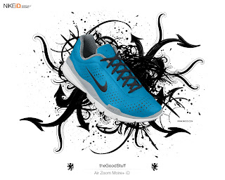
Here's my Nike creation:


Overall, the Nike site was more user-friendly and seemed to provide more options to the user compared to Puma. With this in mind, I think that Nike used technology to create the better customer experience. However, in terms of design quality, Puma won hands down in my opinion simply because Nike seemed to have only the standard colors as opposed to the myriad of textures and great designs (as seen on the collar lining) that Puma offered to users. In other words, from a purely functionality and usability standpoint Nike was clearly the winner, but when it came to design, Puma took the trophy. Nike did a stellar job with its personalization option (especially the iD feature) while Puma didn't perform as well in terms of allowing the user to personalize the product with words. However, the quality of the design from Puma trumps Nike's offerings in my eyes. Based on these observations, Nike wins on the basis of personalization of its products as well as the functionality and usability of its site while Puma wins on the basis of design quality and effective use of themes to create a certain ambiance.